Wednesday, December 7, 2011
2nd Nine Weeks - 4th Assignment
On the carter Mountain Roll I took a picture of a girl in vines and An Apple. i like the picture of the girl because it's more of a silhouette and it's just 2 plain colors. I think the picture of the apple could have been better. I could have used a filter where there aren't as many gray looks. But in total I thought it was a good roll and I had a lot to choose from.
2nd nine weeks - 3rd assignment


Brighter lighting and more colors work better with Polaroid Lift-offs. Simple Pictures like, A portrait or a flower or something not to busy-looking looks a lot better than a picture of like, the city. Busy. A lot of movement. It just just doesn't work well.
2nd Nine Weeks - 2nd Assignment


A good sepia print needs to have all the elements. (Strong Subject, Rule of thirds, Not a lot of distractions, Unique Angle, etc) But not any picture looks good in sepia. Like, A fast moving city. Pictures with an older look always look better. Like, an old city. Children playing. Plants/Flowers.
My Sepia Prints are of A flower and An apple. I think I did considerably well on this roll.
Friday, November 4, 2011
2nd 9 weeks. (Assignment 1)

I like this picture because of the tear drops. They're not running or anything. Tey're just sitting there and it draws more attentioon to the women's eyes.

I like this picture because of the look. Their hands together. It's just really cool. It's nothing that you can explain. It's just really cool.
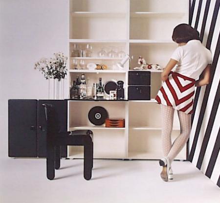
I think this picture is really cool because of the lines on the walls and on her skirt.

This picture is really cool because there are some blurry aspects but there are also some sharp points like the man who is jumping

I like that this picture is completely centered. It still looks really good being centered.
Monday, October 31, 2011
2011, 7th assignment - Hand Coloring


I like when A hand coloring picture that doesn't look like a photograph, but a painting. I think the photograph should be colored because you never see a painting that's only half way painted. I like my hand coloring picture of the flag because it looks painted but the one of the reese's cup could have had more color to it and When I was printing it, I shouldn't have exposed it as long.
Friday, October 21, 2011
2011, 6th Assignment - Cross Processing


To have a good cross processed picture there should be a good amount of color.
I was actually pretty impressed with my roll. I had some good colors and they just came out well. But, If I could have done soemthing different I would have looked for more color.
Wednesday, October 19, 2011
2011, 5th Assignment - Solarization


2011, 4th Assignment - Polaroid Transfers


A good polaroid transfer, much like these, have to have an obvious center of interest and the colors have to be right, and the details need to be shown. I think i did well on this roll. ( i don't know why i'm in italics)
Tuesday, October 18, 2011
2011, 3rd Assignment - Layers


1st Photograph: 4 layers. The foreground with the water. The rocks with the green. The rocks on the left and The green in the background. I like this picture because of how the water looks. You can almost see it running down the rocks. My eyes want to go to the green in the middle of the photograph but I still look at everything else in it.
2nd Photograph: 6 layers. The forground with the water. The birds. The men. The grass. the mountains. The sky. This photograph works because the layers are easily identified. It's not an easy photo to be taken. It looks rather difficult. But it could be immitated.
3rd Photograph:3 layers. The man, singing. The fan's hands. And their faces. This picture has a lot of distracting points because the background is really bright and I look there before I look at him.
4th photograph: 6 layers. Each mountain being a layer. The row of mountains in the background and the sky. I like this because there are leading lines and I want to look at everything in the photo, not just one specific thing.
This assignment made me think more about what I'm incorperating in my photography and make it seem more interesting. A simple picture, like the one in my last entry is nice but sometimes they get boring do incorporating other things into the background makes it seem more interesting and not so dull. Fiber paper makes the photograph's details pop out more.
I think I did fairly well on this roll. The one thing that I don't like about it is the one of the girl next the wall doesn't have very many deatils to it. But other than that i think I ndid well.
Friday, October 14, 2011
2011, 2nd Assignment - 3200 film


I like thses pictures because they're not really sharp but you can still see the subjects. The first one is nice because My eyes are drawn straight to the man but I still want to see everything else in the photo. The second photo is more simple but still a very noce picture. I would use these picture for influence because they have nice subject. Exposers right. They're just really good pictures. The grain is right. I like this speed of film more because of the look of the pictures.
2011, 1st Assignment - First roll feelings
I think I did pretty well on my first roll. The Pictures were really bright for some reason but I got them to come out. I would have used a lower filter on the flower one because it's so bright and there's a lot of contrast. I could have burned more on the one of Mariah outside because of the lights around her. But Other than that, I'mn pretty comfortable with everything.
Monday, June 6, 2011
Portraits


This picture Is cool because the smoke.

Going against
You take a normal light meter reading and increase or decrease it a little bit to get a more dramatic feel.
A great photograph
A great photograph is abnormal and is not like all the others. Crazy makeup makes it all more fun. Stage them in a different way.
national geographic
• Waiting for the perfect shot (not just taking one random shot and leaving but waiting for what you want and getting that shot. It may take a few minutes, it may take all day.)
•Not being afraid to get in close. (If you want a good picture it helps to get close to what you are looking at.)
•Don't be afraid to get dramatic pictures. (Like the picture with the little boy with all his sheep killed. the photographer was intense)
•natural Lighting. (adding lighting can look staged and boring. But using nnatural lighting is more challenging.)
••
framing

I like this picture because the persomis facing the light so it is just the outline of their body. And the bridge looks reallt cool framing them.
I like this one because it is very simple yet it the tree is so unique.

This picture is cool because the colors are brilliant and the water is really bright.

I was drawn to this picture because the leaves are framing water. I like it because thebridge thing looks really cool...

 I really like this picture. The two people are framed by more people and a town. It looks really neat..
Subscribe to:
Posts (Atom)