Welcome

Welcome to my photography blog:)

Tuesday, January 17, 2012

Studio Lighting - Roll 6

IMAGE41 450x309 Control Light and Get the Look You Want Using Flash Photography
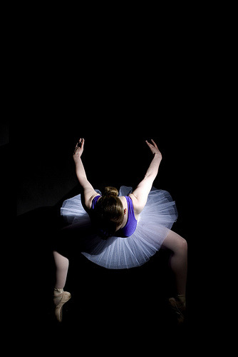
I like this picture because of how much detail there is. In the background.
In the girl. I like how bright and white she is and how dark the background
is.

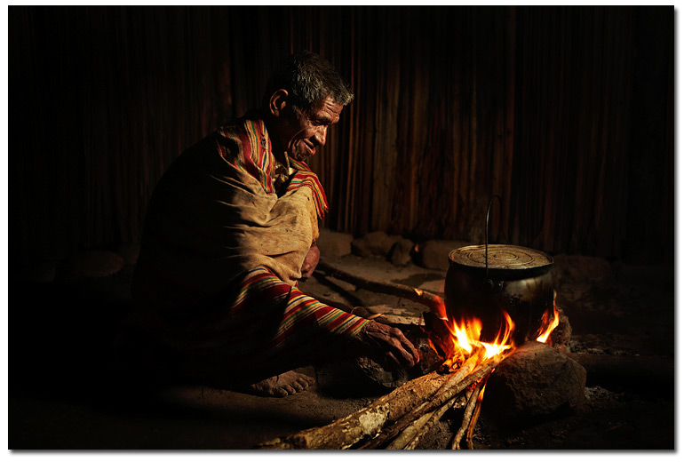
The lighting is coming from in front of the man so the front of his body
and face are lit but it fades darker in the background

This picture is really cool because it's not too bright but the shudder
speed is really fast so it's all sharp.


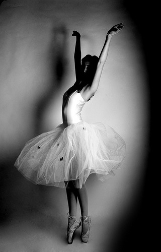
The dancer in these photos are bright and sharp but in the first one there's not too much detail.
I like them
Ballet in the studio.

Roll 5 - Realistic or Ambiguous photographs

 This picture has the rule of thirds and doesn't look too posed. The girl is "unaware" of her picture being taken so it's a good ambiguous photo.
 The kid moving his head makes it look more natural than posed. I like how the camera is focused more on the child's hand, rather than his face.
The kids are all doing something different and looking away. It's cool that there's a window or mirror there. It adds another aspect to the picture.
 Like the other picture, this is really cool because he's not too sharp and it's focused on the child's hands. leaving his face blurry. It's not out of focus or anything but the shutter speed isn't the fastest.
This picture is kind of posed but it's still cool. There are leading lines and they're framed. It's really cool.

Wednesday, December 7, 2011

2nd Nine Weeks - 4th Assignment

On the carter Mountain Roll I took a picture of a girl in vines and An Apple. i like the picture of the girl because it's more of a silhouette and it's just 2 plain colors. I think the picture of the apple could have been better. I could have used a filter where there aren't as many gray looks. But in total I thought it was a good roll and I had a lot to choose from.

2nd nine weeks - 3rd assignment


Brighter lighting and more colors work better with Polaroid Lift-offs. Simple Pictures like, A portrait or a flower or something not to busy-looking looks a lot better than a picture of like, the city. Busy. A lot of movement. It just just doesn't work well.

2nd Nine Weeks - 2nd Assignment


A good sepia print needs to have all the elements. (Strong Subject, Rule of thirds, Not a lot of distractions, Unique Angle, etc) But not any picture looks good in sepia. Like, A fast moving city. Pictures with an older look always look better. Like, an old city. Children playing. Plants/Flowers.
My Sepia Prints are of  A flower and An apple. I think I did considerably well on this roll.

Friday, November 4, 2011

2nd 9 weeks. (Assignment 1)


I like this picture because of the tear drops. They're not running or anything. Tey're just sitting there and it draws more attentioon to the women's eyes.

I like this picture because of the look. Their hands together. It's just really cool. It's nothing that you can explain. It's just really cool.

I think this picture is really cool because of the lines on the walls and on her skirt.

This picture is really cool because there are some blurry aspects but there are also some sharp points like the man who is jumping

I like that this picture is completely centered. It still looks really good being centered.

Monday, October 31, 2011

2011, 7th assignment - Hand Coloring

cabin in the woods Hand Colored Photo (c) Lynne Medsker


I like when A hand coloring picture that doesn't look like a photograph, but a painting. I think the photograph should be colored because you never see a painting that's only half way painted. I like my hand coloring picture of the flag because it looks painted but the one of the reese's cup could have had more color to it and When I was printing it, I shouldn't have exposed it as long.