Wednesday, December 7, 2011
2nd Nine Weeks - 4th Assignment
On the carter Mountain Roll I took a picture of a girl in vines and An Apple. i like the picture of the girl because it's more of a silhouette and it's just 2 plain colors. I think the picture of the apple could have been better. I could have used a filter where there aren't as many gray looks. But in total I thought it was a good roll and I had a lot to choose from.
2nd nine weeks - 3rd assignment


Brighter lighting and more colors work better with Polaroid Lift-offs. Simple Pictures like, A portrait or a flower or something not to busy-looking looks a lot better than a picture of like, the city. Busy. A lot of movement. It just just doesn't work well.
2nd Nine Weeks - 2nd Assignment
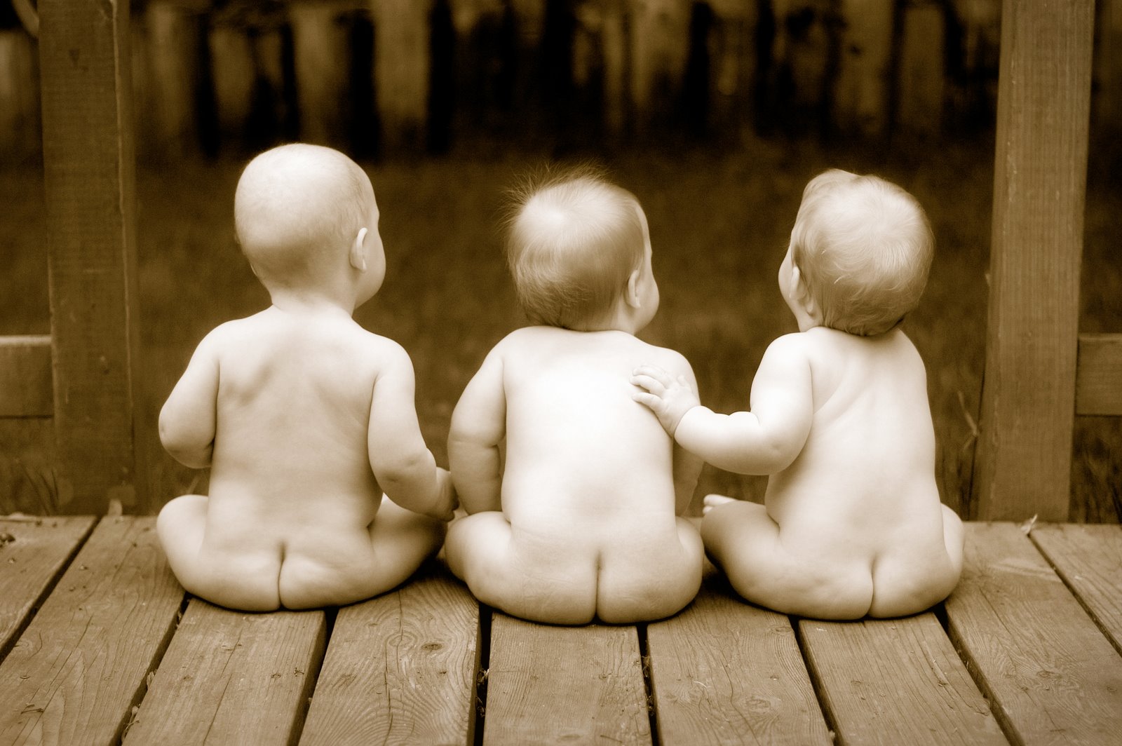


A good sepia print needs to have all the elements. (Strong Subject, Rule of thirds, Not a lot of distractions, Unique Angle, etc) But not any picture looks good in sepia. Like, A fast moving city. Pictures with an older look always look better. Like, an old city. Children playing. Plants/Flowers.
My Sepia Prints are of A flower and An apple. I think I did considerably well on this roll.
Friday, November 4, 2011
2nd 9 weeks. (Assignment 1)

I like this picture because of the tear drops. They're not running or anything. Tey're just sitting there and it draws more attentioon to the women's eyes.

I like this picture because of the look. Their hands together. It's just really cool. It's nothing that you can explain. It's just really cool.

I think this picture is really cool because of the lines on the walls and on her skirt.

This picture is really cool because there are some blurry aspects but there are also some sharp points like the man who is jumping

I like that this picture is completely centered. It still looks really good being centered.
Monday, October 31, 2011
2011, 7th assignment - Hand Coloring


I like when A hand coloring picture that doesn't look like a photograph, but a painting. I think the photograph should be colored because you never see a painting that's only half way painted. I like my hand coloring picture of the flag because it looks painted but the one of the reese's cup could have had more color to it and When I was printing it, I shouldn't have exposed it as long.
Friday, October 21, 2011
2011, 6th Assignment - Cross Processing


To have a good cross processed picture there should be a good amount of color.
I was actually pretty impressed with my roll. I had some good colors and they just came out well. But, If I could have done soemthing different I would have looked for more color.
Wednesday, October 19, 2011
2011, 5th Assignment - Solarization


Subscribe to:
Comments (Atom)